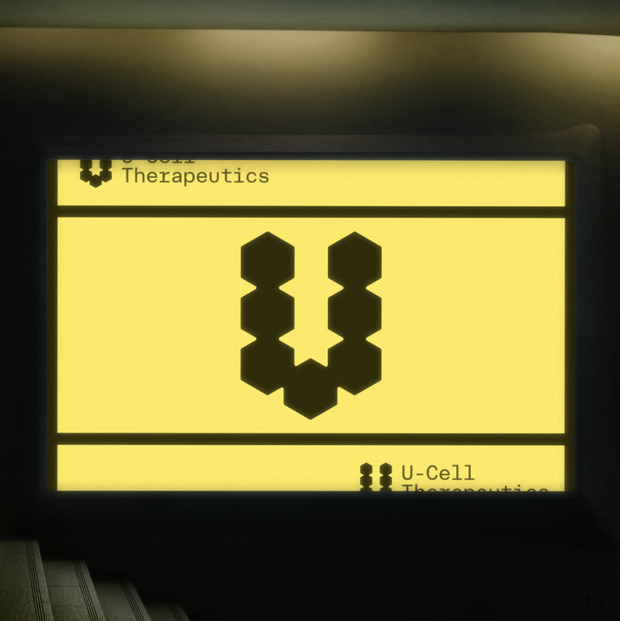
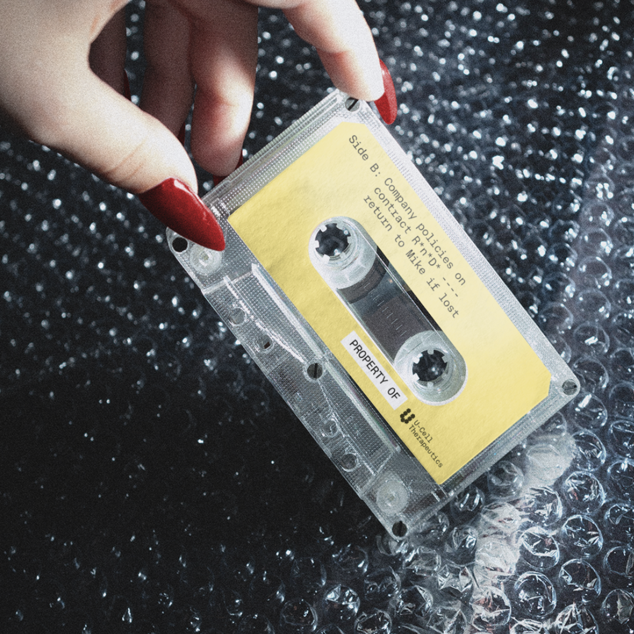
U-Cell approached us with a simple request. Give us something unique but not flashy. Leaning heavily on the nostalgic 80’s officecore trend, we developed a simple visual identity that was unashamedly corporate. The symbol is further meaningful as it relates directly to the cellular research going on for our private client.
︎︎︎ Design and Art Direction: Matthew Roop and Dylan Chan at YEYE Design Studio